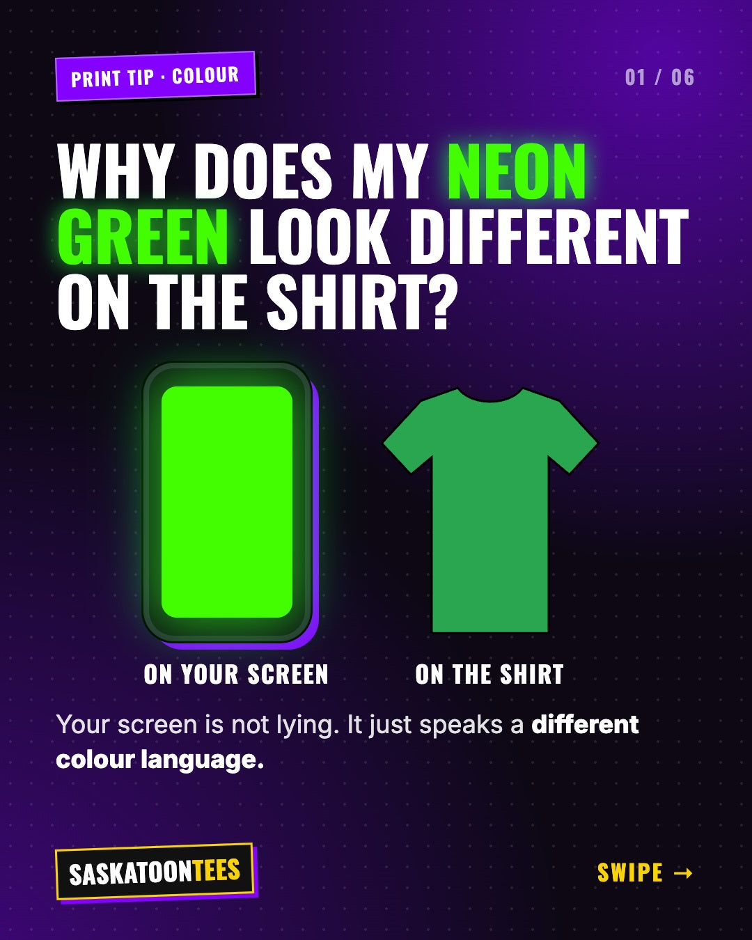
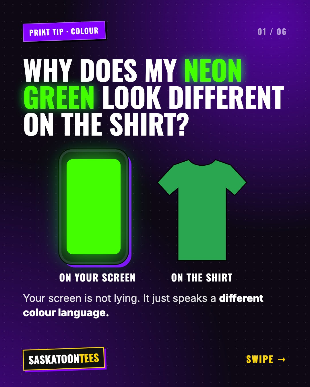
Your design looks electric on your phone, then the printed shirt looks a little calmer. Nothing went wrong. Screens and printers speak two different colour languages: RGB and CMYK. Here is what that means, which colours shift the most, and how to get the closest match on your custom shirts.
The short answer
Screens create colour with light (RGB). Printers create colour with ink (CMYK). Light can glow and ink cannot, so a few very bright screen colours, especially neons, print slightly softer than they look on your screen.
What is RGB?
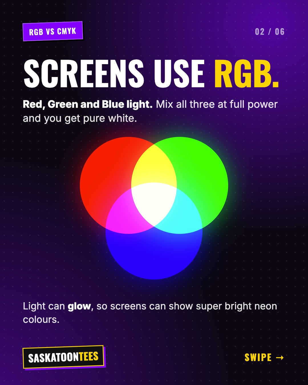
RGB stands for red, green and blue. Phones, laptops and TVs mix these three colours of light to make every colour you see. Mix all three at full power and you get pure white. Because a screen gives off its own light, it can show super bright neon colours.
What is CMYK?
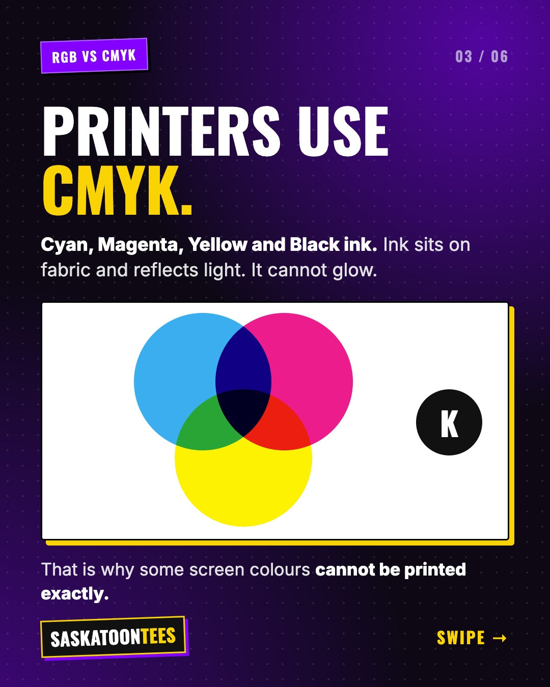
CMYK stands for cyan, magenta, yellow and black (the K). Printers mix these four inks to make colour. Ink sits on the fabric and reflects light instead of giving it off, so it cannot glow. That is why some screen colours cannot be printed exactly.
Which colours shift the most?
Most colours print very close to what you see. The ones that change the most are the brightest, most saturated screen colours:
| Colour on screen | What happens in print |
|---|---|
| Neon green | Prints as a richer, deeper green |
| Electric blue | Prints closer to a royal or navy blue |
| Hot pink | Prints as a strong magenta pink |
| Bright orange | Prints slightly softer and warmer |
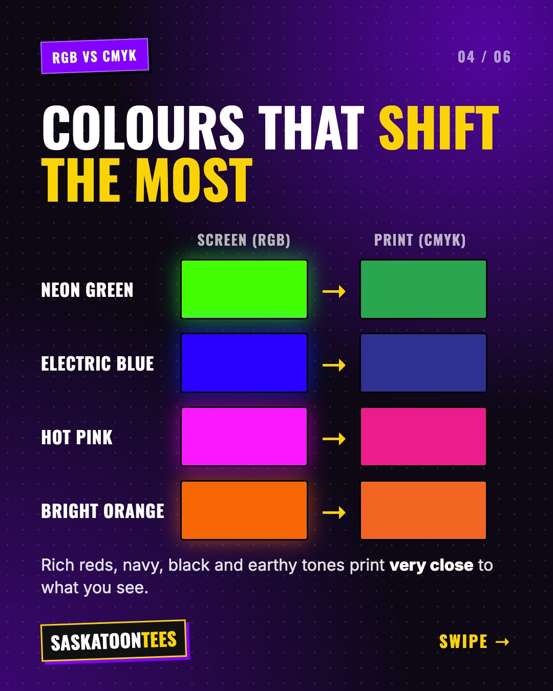
Rich reds, navy, black, white and earthy tones print very close to what you see on screen.
How to get the closest colour match
- Design in CMYK mode if your app has it (Photoshop, Illustrator and Affinity all do)
- Skip neon colours for the most important parts of your logo
- Send your brand colour codes, HEX or Pantone, so we can match as closely as possible
- Check your mockup before we print
How we print at Saskatoon Tees
Our DTF printing uses CMYK plus a layer of white ink. That white layer is what makes your colours pop on dark shirts, so a design looks just as bright on a black hoodie as on a white tee.
Not sure about your colours? Send your design. We will check it and send you a mockup before anything prints.
Also worth a read: JPEG vs PNG: why your logo printed in a white box and DTF vs screen printing vs vinyl.
Get your colours right the first time
Send us your design and we will send a free mockup and quote. No minimums, printed right here in Saskatoon.
Upload my artworkGet a free quoteFrequently asked questions
Why does my shirt colour look different from my screen?
Screens use RGB light and printers use CMYK ink. Very bright screen colours like neon green cannot be reproduced exactly with ink, so they print a little softer.
Should I send my design in RGB or CMYK?
CMYK gives you the most accurate preview. If your file is RGB, that is fine. We convert it and show you a mockup first.
Can you match my brand colours?
Send us your HEX or Pantone codes and we will get as close as CMYK ink allows. Most brand colours match very closely.
Do colours look good on dark shirts?
Yes. We print a white ink layer under your design so colours stay bright on black, navy and other dark garments.